Metro Design Blog

Consistency in Design

Rules of Minimalist Graphic Design

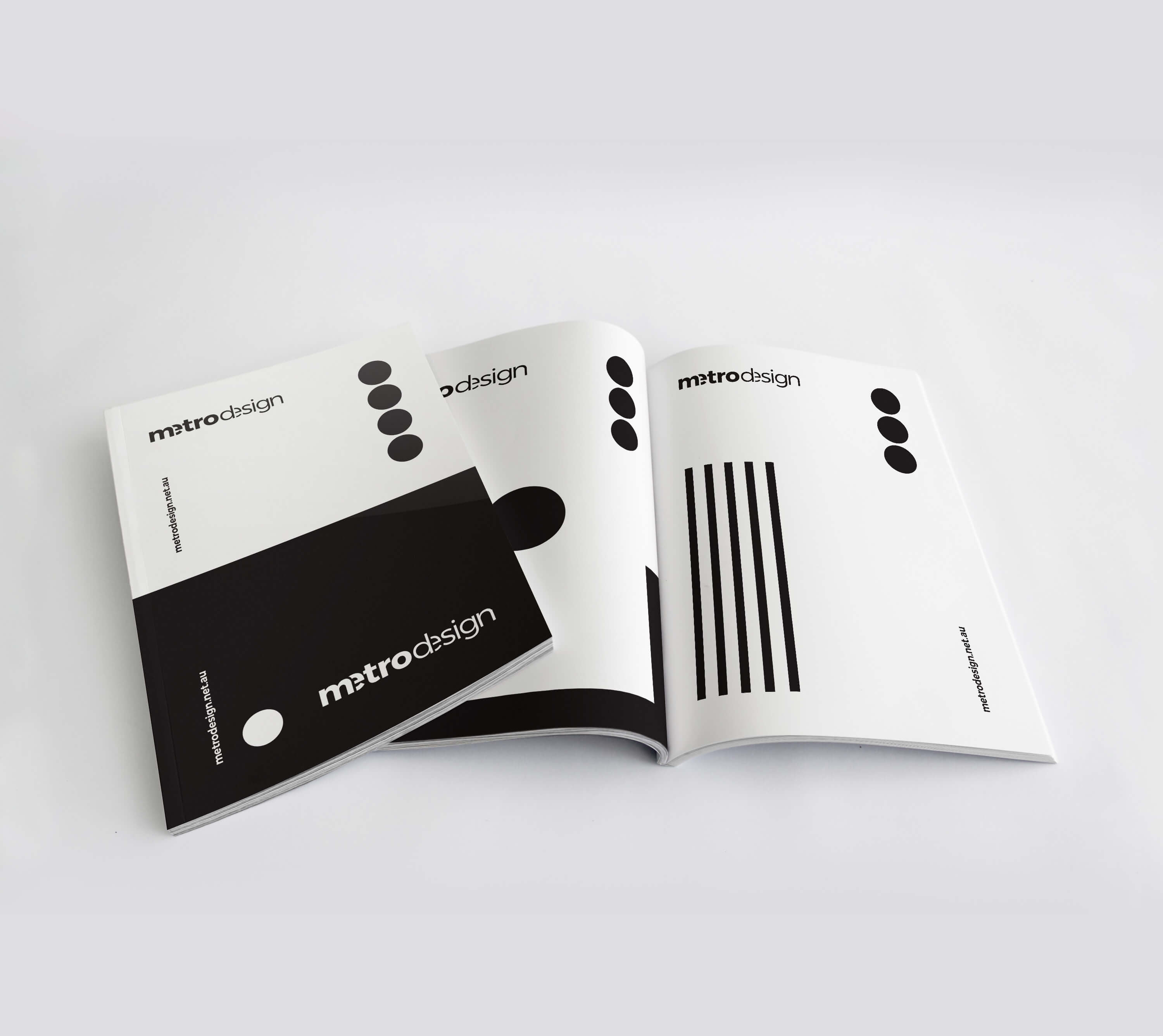
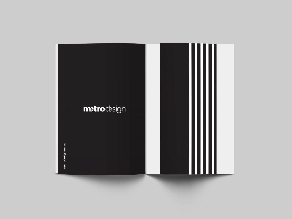
At Metro Design Sydney, we believe that every element in a clean graphic or web design should be consistent throughout all pages on the site or document. We prefer to guide our artwork by rules of minimalist design which is crisp and timeless and also stands out against all the other design clutter because it’s different.

As a design movement, minimalism is still relatively new, having only come into its own in the late 1960s. It’s certainly still relevant today. The main idea in minimalist design is “LESS IS MORE“.
black-and-white-logo-minimalist-design-metrodesign-branding-webdesign-graphic-clean--minimalistic-designer-bexley-kogarah-spread

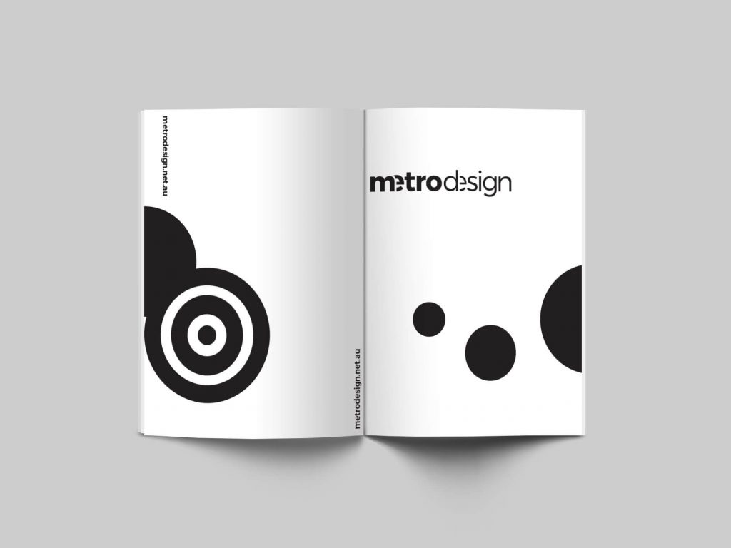
European origins of minimalist visual art are found in the geometric-abstraction creations of the famous Bauhaus movement. One of the Bauhaus slogans was the line, form follows function, which means that any design should prioritize usability over aesthetic considerations.
black-and-white-logo-minimalist-design-metrodesign-branding-webdesign-graphic-clean--minimalistic-designer-bexley-kogarah-sydney-3

Another big connection to minimalist design is Swiss Design. This movement made a massive impact on design in the 20th century and beyond. Swiss designers are known for dedication to order (grid system).

What are all rules of minimalist graphic design?

  • Less is more
  • Keep it simple
  • Engage contrast
  • Leave empty spaces
  • Use simple or little colour
  • Use only the bare necessities
  • Implement a flat design
  • Keep it balanced
  • Use grids to maintain an organization of elements
  • Use typography wisely

While minimalism often appears simple on the outside, a lot of thought, practice and time go into the production and development of a minimalistic piece. 
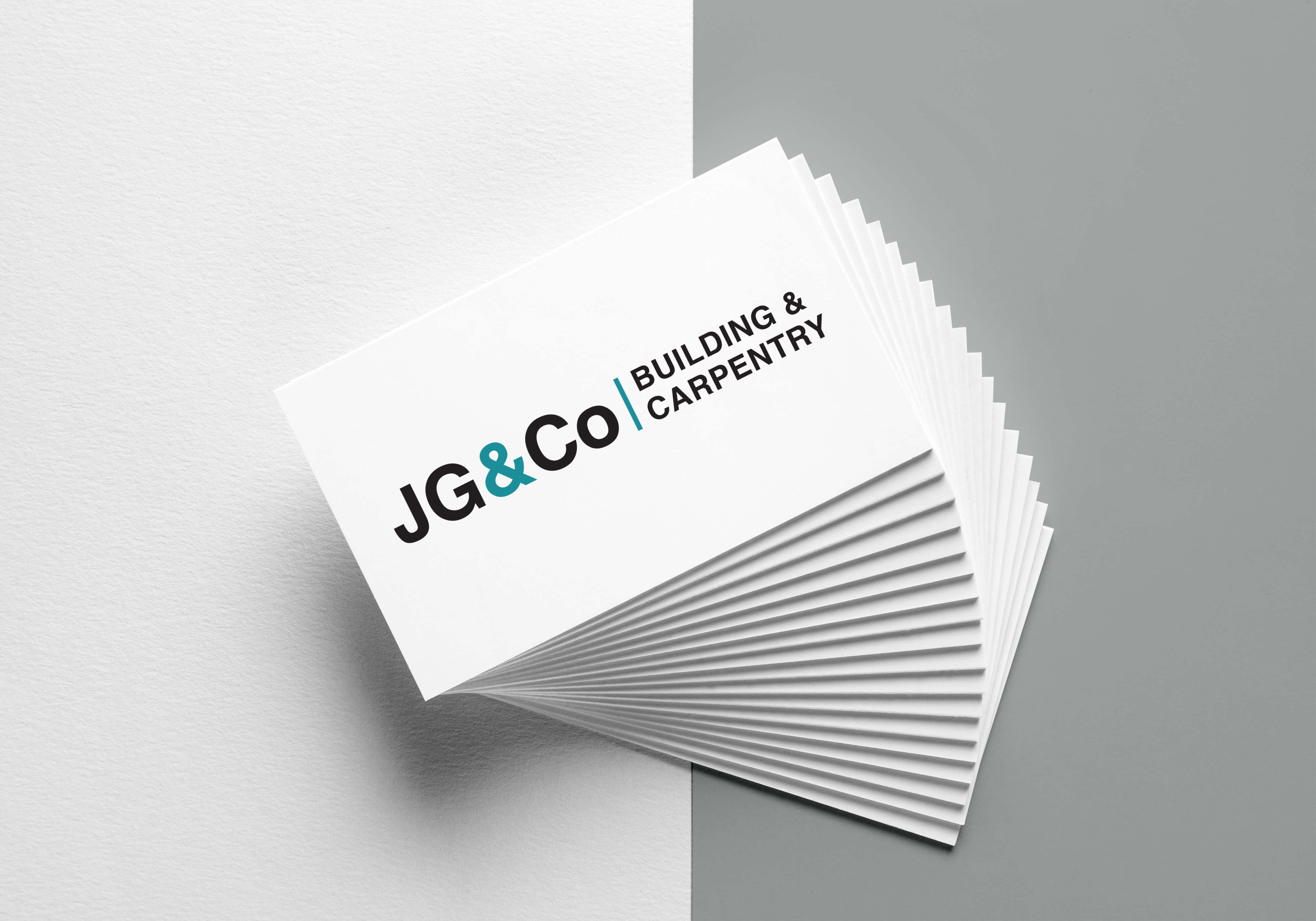
When used well, white space can help balance out your design, declutter it and help it breathe. Take a look at this business card example for building and carpentry business, where the idea of white space has been embraced, resulting in a timeless and minimal design.

Minimalism is one of the design trends that just never gets old. The simplicity of it makes minimalism easy to incorporate into a number of other styles and trends. It is classic and classy.

Feel free to ask questions or start your own project by Contacting Us

Rules of Minimalist Graphic Design

At Metro Design Sydney, we believe that every element in a clean graphic or web design should be consistent throughout all pages on the site or document. We prefer to guide our artwork by rules of minimalist design which is crisp and timeless and also stands out against all the other design clutter because it’s different.

As a design movement, minimalism is still relatively new, having only come into its own in the late 1960s. It’s certainly still relevant today. The main idea in minimalist design is “LESS IS MORE“.

black-and-white-logo-minimalist-design-metrodesign-branding-webdesign-gr

European origins of minimalist visual art are found in the geometric-abstraction creations of the famous Bauhaus movement. One of the Bauhaus slogans was the line, form follows function, which means that any design should prioritize usability over aesthetic considerations.

black-and-white-logo-minimalist-design-metrodesign-branding-webdesign-graphic-clean--minimalistic-designer-bexley-kogarah

Another big connection to minimalist design is Swiss Design. This movement made a massive impact on design in the 20th century and beyond. Swiss designers are known for dedication to order (grid system).

What are all rules of minimalist graphic design?

  • Less is more
  • Keep it simple
  • Engage contrast
  • Leave empty spaces
  • Use simple or little colour
  • Use only the bare necessities
  • Implement a flat design
  • Keep it balanced
  • Use grids to maintain an organization of elements
  • Use typography wisely

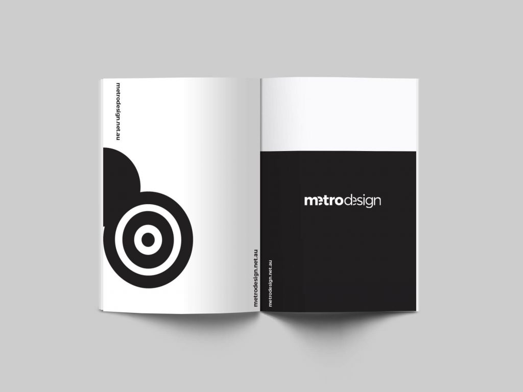
While minimalism often appears simple on the outside, a lot of thought, practice and time go into the production and development of a minimalistic piece. 
black-and-white-logo-minimalist-design-metrodesign-branding-webdesign-graphic-clean--minimalistic-designer-bexley-kogarah-sydney
black-and-white-logo-minimalist-design-metrodes

 When used well, white space can help balance out your design, declutter it and help it breathe. Take a look at this business card example for building and carpentry business, where the idea of white space has been embraced, resulting in a timeless and minimal design.
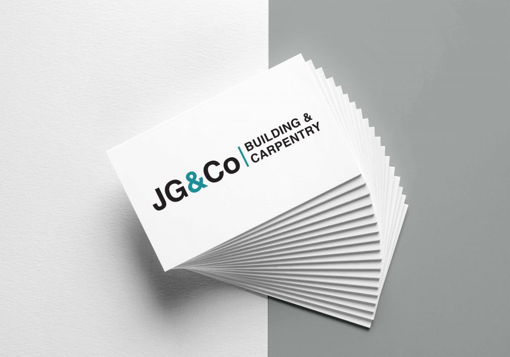
JG&Co-business-cards-metrodesign-branding-logo-and-graphic-design-service-for-builder-building-carpentry-company-apparel-designer-sydney-bexley-kogarah

Minimalism is one of the design trends that just never gets old. The simplicity of it makes minimalism easy to incorporate into a number of other styles and trends. It is classic and classy.

black-and-white-logo-minimalist-design-metrodesign-branding-webdesign-graphic-clean--minimalistic-designer-bexley-kogarah-sydney-1

Feel free to ask questions or start your own project by Contacting Us

Consistency in Design

At Metro Design Sydney, we believe that every element in a clean graphic or web design should be consistent throughout all pages on the site or document. Heading sizes, colors, and fonts should be defined and used consistently throughout the site or document. Additionally, the style of buttons and other elements should complement each other, and match across the entire site or document.

Consistent use of high-quality photos of the same tone, quality, and treatment can take the look of your design to a new level.

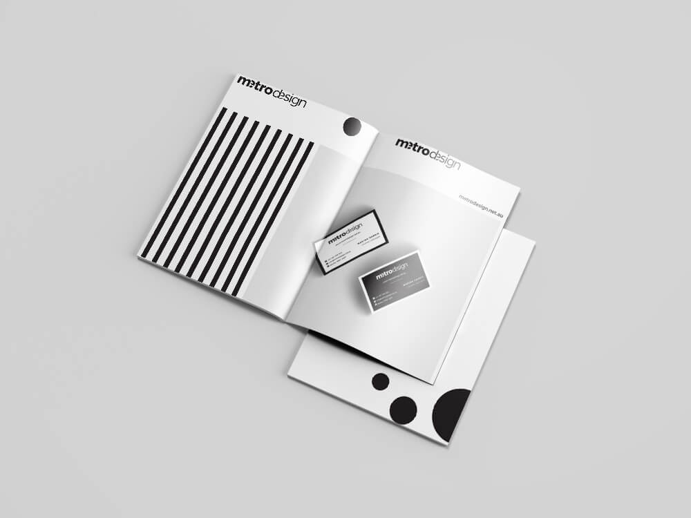
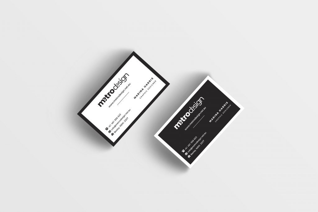
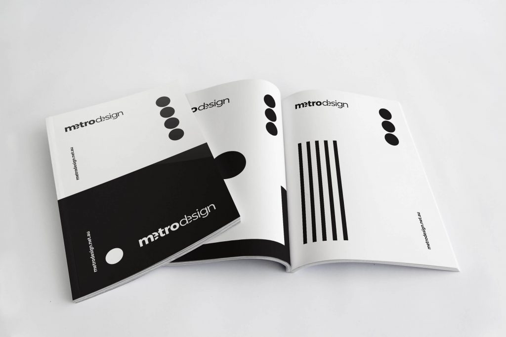
For example, we have chosen simple black and white branding, we keep it consistent across different media from business cards, signage to our website.

Feel free to ask questions or start your own project by Contacting Us
Scroll to top